I Love Bachata Festival
Creating more clarity and optimizing the user experience

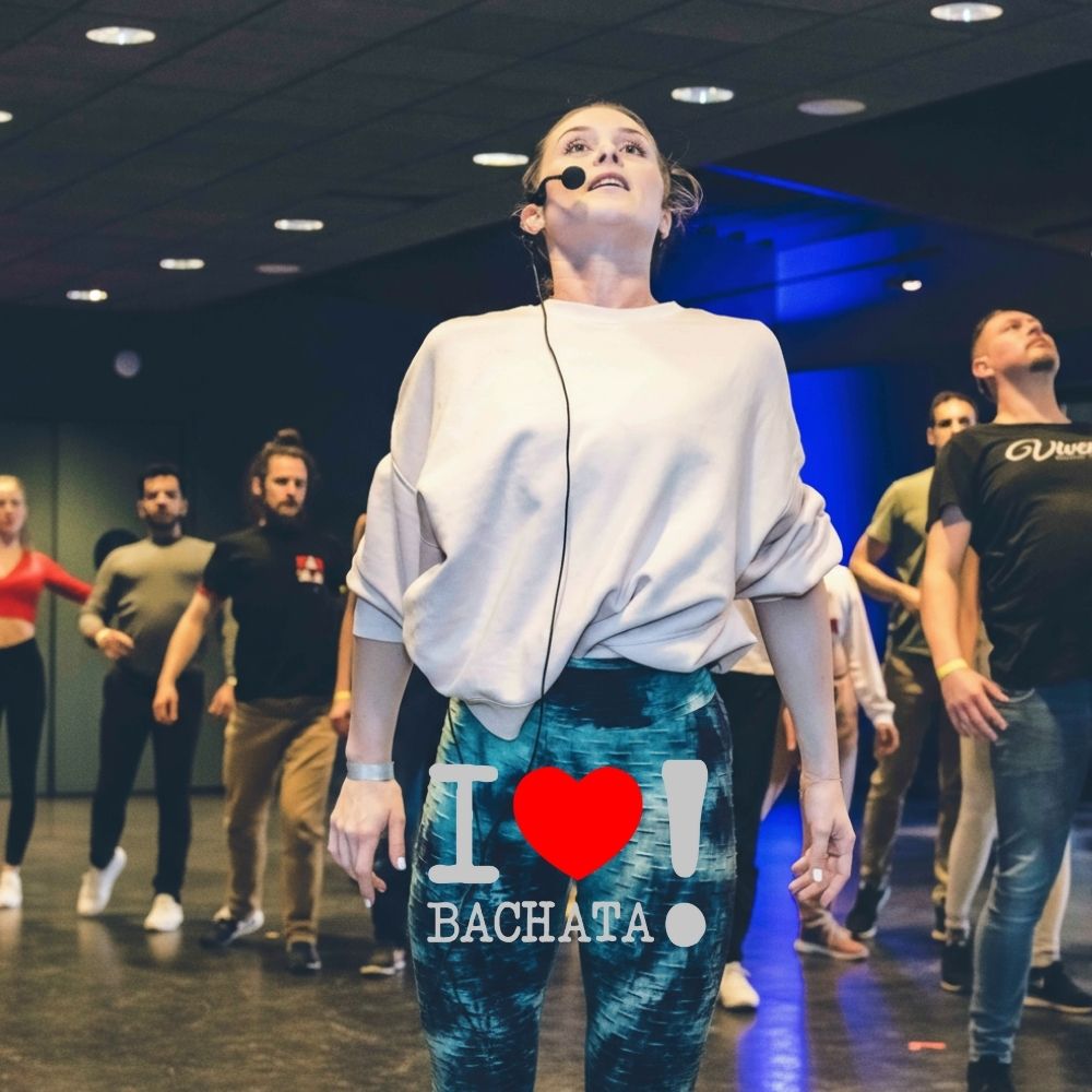
I Love Bachata is a Bachata festival in Leuven that attracts dancers from Belgium and different countries.
On the dance floor, the experience was strong and well-organised. The friction appeared elsewhere.
Every year, the same issues returned and there was a need for a change.
Visitors were excited about the festival, but struggled to find clear information beforehand. Schedules were hard to interpret, artist line-ups were unclear, and dancers often didn’t know which workshops matched their level. Practical details were scattered or missing altogether.
This led to confusion before the event and repeated questions during the festival itself. The quality of the experience on-site was high, but the online communication didn’t support it. The same uncertainty came back edition after edition.
The problem wasn’t promotion. It was the lack of clarity at moments when people needed it most.
The goal was to remove that recurring friction and frustration.
Instead of “having a website”, the focus was to create a single, clear place where dancers could understand what the festival offered, how to navigate the program, and what choices made sense for them personally.
The website and communication needed to support decision-making, not add another layer of uncertainty and extra movements.
The starting point wasn’t design, but behaviour of the visitors and the users of the website.
Being a dancer myself, I recognised the same problems and frustrations that come up before every edition. I also talked with other dancers to hear where they kept getting stuck or confused.
The structure was built around that feedback. Content and navigation followed the logic the visitor would like to experience. Before everything went live, there was a need for a testing group of dancers that could verify the ease of use and the amount of information there was available.
After the testing was done, the website went live. We tested together with the organizer how and what the feedback was so we could adjust on the go. Thanks to the big and great community, there was room to get as much feedback as possible.
Besides the feedback, I tracked with the team, how the sales were going. How many people went from the main information to the checkout and why some of them did or didn’t buy.
What are the outcomes of this project?
Visitors kept the website open to check timings, artists, and practical info when needed. Confusion around schedules, artists, and levels dropped significantly.
Beyond the experience itself, the clearer communication also translated into stronger results for the organisation, making it possible to launch a second edition within the same year.
This case wasn’t about building something new for the sake of it.
It was about addressing a recurring problem that returned every year because it was never properly solved. After fixing what visitors kept struggling with every year, everything became easier, dancers were happy and the sales went up.